Custom Style Blocks
A custom style block enables different styles to be applied to content within a single article.
For example, the default style applied to an article may have a white background and black text using Verdana as the paragraph font style. By using a style block, it allows these rules to be overridden for particular sections of the article. This is useful when trying to highlight or bring attention to important content.

Working with Style Blocks
Custom Style Blocks offer the same styling options as the default text components, with the addition of being able to use background images. Each custom style block is style specific and there is no limit to the number of blocks that can be created or applied.
Creating a Custom Style Block
- From the Style manager, select the style you want to create a custom style block
- Scroll to the 'Custom Blocks' section at the bottom of the style builder and select '+Create Block'

- This will create a new style block which inherit all the style properties applied to the default text components
- Select the text components you want to customise (e.g. Font, Colour, Size etc)
- To change background properties and padding, click the 'paintbrush' button.

- Once finished, click 'Save' to update the style.


Editing a Custom Style Block
To make changes to an existing style block click the text component you wish to change and apply the changes.
Alternatively, to change the padding, background colour/image, position, or even apply custom CSS, select the paintbrush icon again to access the Custom Style Block properties.
Rename / duplicate / delete Custom Style Block
Click the 'More Options' button to rename, duplicate or delete a custom style block.

Applying a Custom Style Block
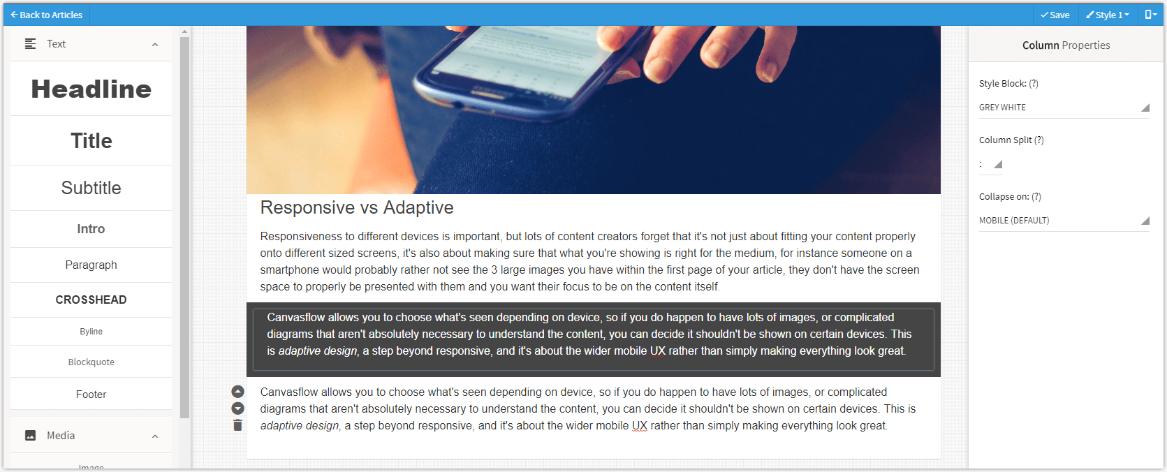
Style blocks can be applied to article content via columns.
- Access the article to which you want to apply a style block
- Select 'Layouts' in the article builder menu and drag any column onto the article
- Hover the column and click the 'paintbrush' button to display the column properties panel
- From the drop down menu, select the name of the custom style block you want to apply

- The style block has now been applied. Any text components you add into this block will inherit the styling.
- Save the article to commit the change.
Using the Custom Style Block as a Hero Image
Using the Background Image property of a Custom Style Block it's possible to use it as a hero image. Simple apply a custom style block to a layout component, then add text components which will sit in front of the image.
Custom Style Blocks overview video
The below video provides a top level overview of how to create, customise and apply a new style block to content in an article.
Notes:
- Padding applied to style blocks is in addition to the existing canvas padding.
- By default, Font style, size and bold/italics of the style you're working with will be inherited by the Custom Block text components. This can be overridden at anytime.
- There is no limit to the number of times a Style Blocks can be used.